Understanding the basics of cryptocurrency is essential for any trader or investor looking to develop a solid strategy for increasing their return on investment. However, many people find it challenging to fully understand crypto investing — including crypto charts and how best to read them.
Simply put, a crypto trading chart displays data or information that can help a trader or investor decide when best to enter or exit a position. It helps you discover the best opportunities in the market.
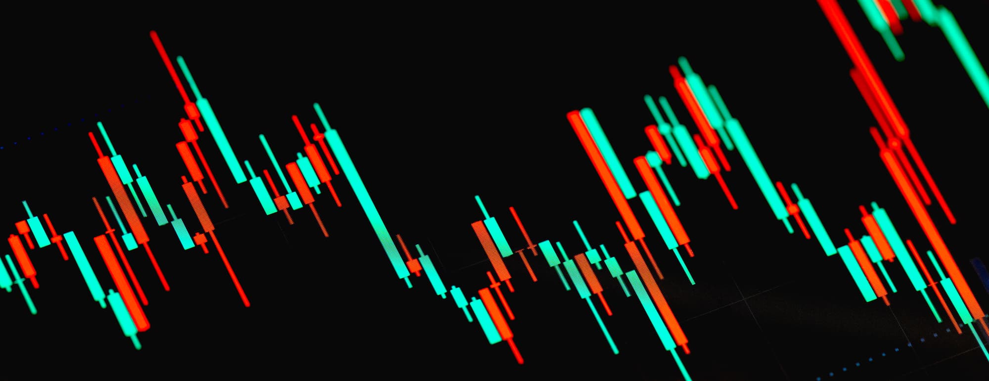
In more technical terms, a crypto chart acts as a visual representation of past and current price movements and volumes at different intervals. More technical analysis of crypto charts can help investors identify market trends based on what has occurred previously, allowing them to predict an asset’s future movement.
Types of Charts for Crypto
There are several different types of crypto charts, each with unique features and attributes that traders can use to evaluate how a crypto asset will perform:
Bar Charts
Bar charts chart contain several vertical price bars. Each bar that is displayed typically shows open, high, low, and closing (OHLC) prices of the asset. The visual information on a bar chart is meant to illustrate how the price of an asset has moved over a given period.
Cryptocurrencies don’t have opening or closing prices, so the horizontal bars on these graphs represent a certain period and the high and low prices within that period. To help distinguish between all of the data and price movements, bar charts are often color-coded, with black or green showing “closing” prices that were above the “opening” price and red showing “closing” prices that were below the “opening” price.
While all crypto charts are generally used to help investors monitor price action, bar charts can specifically help investors analyze trends, potential trend reversals, and monitor volatile price movements.
Line Charts
Line charts are considered one of the more basic types of financial charts because they’re typically used for period-high price depictions only and use very basic visuals. They illustrate the history of an asset’s price movements using a series of data points or dots connected by straight line segments.
Compared to other kinds of charts, line charts are fairly easy to understand. They depict price movement using a single, continuous line and only focus on the highest price of an asset during a given time. Some investors prefer this chart because it is simplified and cuts out all the noise from data on assets during less critical times of the trading day.
Other investors, however, may not like line charts because crypto is volatile. Further, trading happens at all hours of the day, as opposed to traditional trading, which has limited hours. The simplicity of line charts also means they don’t provide as much detail on trends and patterns, which are useful for making predictions.
Candlestick Charts
Candlestick charts are sometimes likened to bar charts, but they are not the same. This is because they use shapes that look similar to bars, and each of those shapes or “candlesticks” shows the opening, closing, high, and low prices. While this basic setup is similar to bar charts, the differences stop there.
Candlestick charts likely originated during the 1700s in Japan with the belief that there is a correlation between price fluctuations due to supply and demand and the emotions of traders. The “candlestick” bars in this type of chart are thus thought to represent that emotion by illustrating the size of price moves with different colors. For example, the “bull” candle is green, which means the “closing” price was higher than the “opening” price, and the “bear” candle is red, which means the “closing” price was lower than the “opening” price.
The shadows or “wicks,” which are small lines jutting out from the bars — giving them their candle-like appearance — represent the high and low prices of that time. If the upper wick on a down candle is short, it means the open on that day was high. In contrast, a short wick on an up candle means the close was high. Often, these charts have a wick on both the top and bottom, representing the highest and lowest prices reached for the specified period.
Cryptocurrency investors tend to like candlestick charts for their detailed illustration of trading emotions — the bullish and bearish sentiments — and for their detailed information on trends, patterns, and how an asset moved historically during a certain period. Many believe this type of chart offers more clarity on potential asset moves that are expected to come next.
Point and Figure Charts
Point and figure (P&F) charts are a very basic type of chart typically used for long-term investing strategies. This type of chart uses Xs and Os to show only price movements and disregards the passage of time. The Xs are used to depict price rises, and the Os are used to show price drops.
P&F charts are used to monitor the supply and demand of each asset while helping investors keep an eye on trends, so they can easily determine the best entry and exit points in the market.
These charts are generally not the most popular due to their lack of detail, but they have been gaining some traction in the cryptocurrency trading community. Their simplified visuals make them easier to read, allowing traders to focus on pertinent market information without the noise of other details.
Market Profile Charts
Market profile charts, also referred to as Sierra Chart’s Time Price Opportunity (TPO), depict price, volume, and time frame on a y- and x-axis. The price is illustrated on the vertical y-axis, and the volume is shown on the horizontal x-axis. The time frame is depicted using a combination of letters and/or colors, which can make this chart more confusing to read.
However, many consider TPOs to be a unique form of charting that helps traders and investors better understand price movements, activity, and trends in a particular market. A market profile chart is thought to represent the acceptance or rejection of an asset over a certain period.
Important Crypto Chart Patterns
In addition to the various crypto chart types, there are also different types of chart patterns that can give insight into price trends and their movement. Traders and investors need to understand these various patterns when using charts, as they can help make sense of volatile crypto price fluctuations.
Triangles
Triangle patterns in crypto charts are known as continuation or horizontal trading patterns. When each triangle forms, it’s initially at its widest point; as the market continues to trade, the range of the trading narrows, which brings the triangle to a point on the chart, from left to right. A triangle essentially depicts the losing interest in an asset from the buy- and the sell-side.
The lower line of the triangle represents the demand (when buyers of an asset outpace the sellers), and the top line represents the supply (investors going out and taking profits with them). There are three different kinds of triangle patterns:
- Ascending: An ascending triangle depicts a straight, flat line that shows the recent price highs and a diagonal line that shows the higher price lows. This is considered a “bullish” chart pattern because it shows bullish traders getting rejected at the same resistance level on multiple occasions, with them retreating less and less after each attempt until the price eventually breaks through.
- Descending: Descending triangles represent the same as ascending triangles but in reverse. These patterns are generally a sign of a downtrend and are viewed as a “bearish” pattern. In this case, it shows the sellers overcoming base support after several pushbacks until the price lowers.
- Symmetrical: A symmetrical triangle pattern doesn’t have a flat line but instead has two diagonal lines meeting at a point. Whereas ascending triangles show uptrends and descending triangles show downtrends, symmetrical triangles represent a market with patterns that are aimless in direction. The supply and demand are the same, and the highs and lows come together to a point with no significant volume.
Head and Shoulders
The head and shoulders pattern is considered a more advanced reversal pattern, illustrated with three price peaks. The two smaller peaks represent the shoulders and sit on either side of the middle (head) peak. The lows of each peak are then connected by a flatline, also known as the neckline.
This pattern is used to predict a bullish-to-bearish trend reversal. The up-and-down pattern created from price changes forms the head and shoulder pattern. When the last shoulder forms, the price breaks out. When all peaks point up, this signals a bearish reversal. When all peaks point down, this signals a bullish inverse and suggests a new uptrend is likely to begin.
Tops
There are two types of tops chart patterns:
- Ascending: This pattern shows successive peaks, with each peak progressing higher than the previous one. This indicates a bullish upward trend with prices continuing to go up and up. This type of pattern typically only lasts a matter of minutes, meaning it’s best for short-term investors who can quickly make money during the asset’s short run. However, this pattern does eventually have to come to an end, and when it does — meaning the next peak is lower, not higher—the market will go stagnant.
- Descending: In reverse, this chart pattern shows successive peaks that continue to get lower and lower, meaning the price is continually going down. This represents a downward bearish trend. This trend is typically confirmed after the third successive peak.
There is another kind of top pattern, called the triple and double tops and bottoms, that represents prices that bounce off the same resistance (top) or support (bottom) two to three times in a row. A double bottom indicates a bullish trend, and a double top indicates a bearish trend. Both the triple and double patterns indicate reversal setups and mean prices are about to change direction.
What Are the Best Live Crypto Charts?
When it comes to investing in cryptocurrency, there are a lot of crypto chart options to choose from. Some of the most popular sources for live crypto charts include:
- Cryptowatch: Live price charts, trading, and alerts for cryptocurrencies.
- Live Coin Watch: Live cryptocurrency prices, charts, and portfolios.
- Coin Market Cap: Live cryptocurrency prices by market cap.
- Coindesk: Real-time charts, news, videos, and more.
- CoinCodex: Complete market overview with live prices, charts, and more.
For years, investors have used various types of charts to help them understand the stock market and how assets will perform — and the same holds true for crypto trading. Any kind of chart, whether you’re a new or experienced investor, can be used to evaluate cryptocurrency market trends. It simply depends on your personal preference.
Recent Articles & Insights
-
 Stocks, Bonds, or Crypto? 5 Investment Strategies for Retirement
1. Stock-Based Growth Strategy One of the most common retirement investing strategies involves building a…
-
 Precious Metals 101: Investing in Gold, Silver and Platinum
What Are Precious Metals? Precious metals are rare, naturally occurring metallic elements that hold high…
-
What Is a Silver IRA?
Understanding a Silver IRA A silver IRA is a type of self-directed individual retirement account…